TLDR: Launched 12 funnel experiments resulting in a 6.1% increase in conversions.
Role: Head of Product, Marketing, UX design
KPI: User Acquisition, User Activation
Trym offered men the ability to book in home haircuts before, during, or after the barber shop's operating hours. We managed 3.15% conversion rate on all visitors, but with thousands of men looking for a quality haircut, we had to improve our conversion rate to better scale.
Improving our conversion rate would improve our unit economics and allow us to reach thousands of more users. Our funnel was resulting in high customer acquisition costs. Furthermore as we scaled it was important to maintain a 3:1 LTV/CAC ratio.
If we were able to improve our funnel, then we'd also be able to improve the earnings for our barbers and get closer to reaching network effects.
I worked with our team of engineers and designers to isolate the source of the problem and to fill in the holes with either a new or improved funnel.
The objective was to:
- Increase booked appointments
- Increase the conversion rate per user
- Reduce customer acquisition costs
The first step for us was to start with quantitative analysis which allows us to identify the source of the drop offs. To start we used an audit on using our product analytics to determine where exactly users may be falling off.
I identified the following steps where users fell off:
- 73% fell off at our home page
- 12% fell off at date selector
- 49% fell off at sign up
Now that we had identified where users decided to stop using Trym, we could dig deeper with qualitative analysis. We did this by holding cross-functional meetings to review Trym's user experience using Digital Experience Intelligence tools, analyzing the support tickets users created, and conducting user interviews.
During this process I interviewed 25 users who had not booked and 25 users who had successfully booked. This helped identify the following insights:
Matching
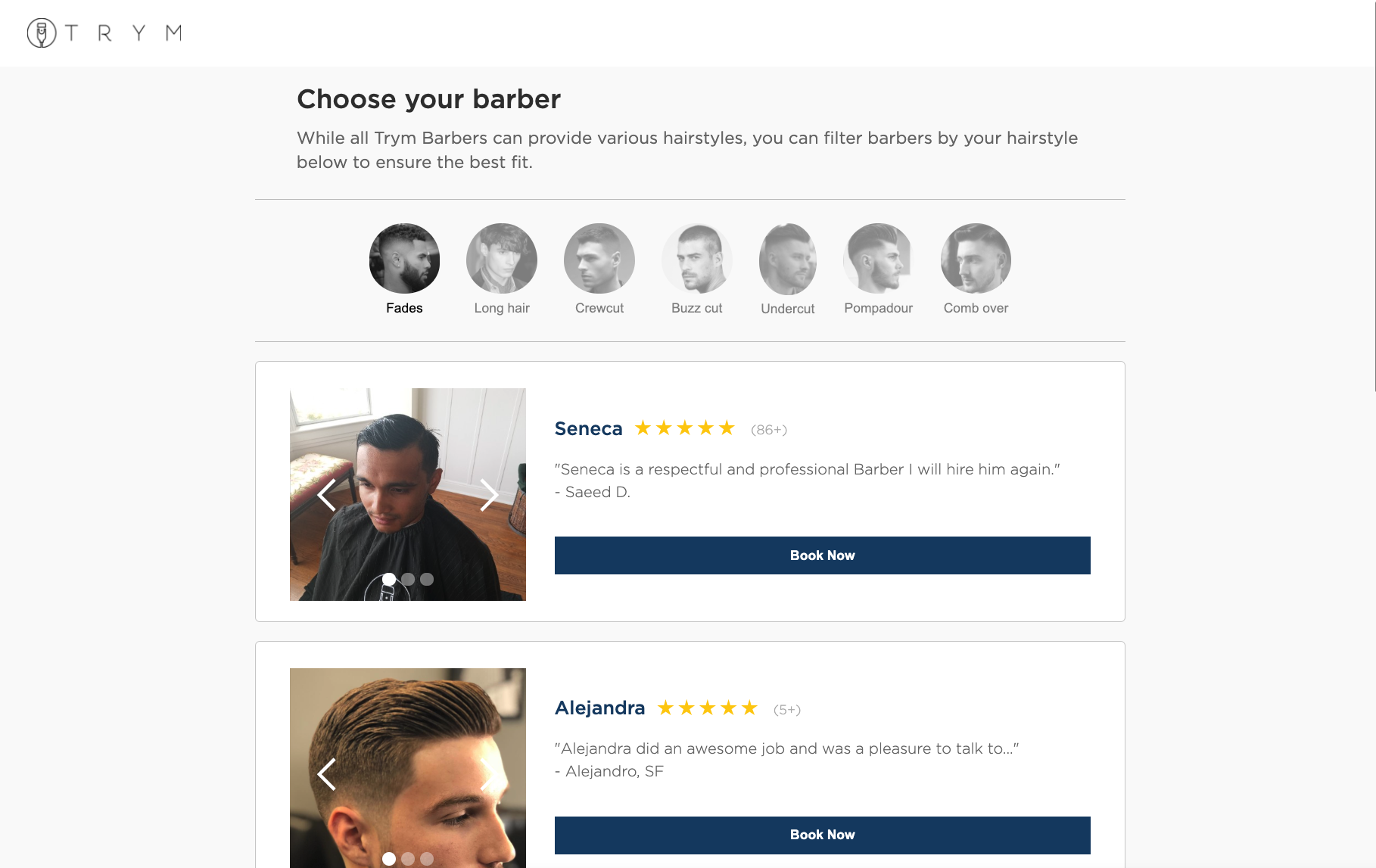
Our booking process didn’t include an option to select a barber. While we made this choice to prioritize convenience, this made it hard for users to close the deal at checkout.
Appointment clarity
It wasn’t clear if upon booking, if the barber would indeed arrive at that select time. We had offered users the ability to select any time in the week and pay prior to confirmation. Furthermore, barbers often required more wiggle room to arrive at the appointment. Both sides of the marketplace had trouble with this step.
How it works
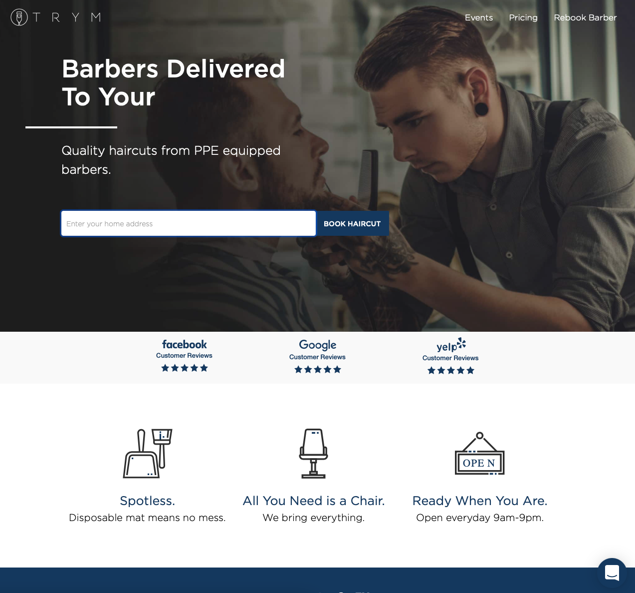
Our landing page didn’t cover all the aspects of the in home haircut process. Now that we had started to expand upon our eager early adopters, many users who signed up but didn’t book wanted to learn more.
Rebooking
Furthermore, we uncovered a problem with returning users who were having trouble booking for a second time with their favorite barber. The existing option in their account was hard to find by our users.
Now I had to decide on which solution to focus on. To do so, I used the following formula:
(Impact x Number users impacted) / Cost of implementation
Here are the scores for each:
Transparency
Messaging at checkout (6)
Availability vs date (6)
Improved landing page (8)
Personalization
Barber-to-client messaging (2)
Barber matching based on hairstyle (4.5)
Barber selection based on hairstyle (3)
Rebooking
New rebooking mechanism (8)
Barber profiles (5)
To validate my approach and impact hypothesis, we conducted built prototypes, conducted user interviews, and ran A/B tests.
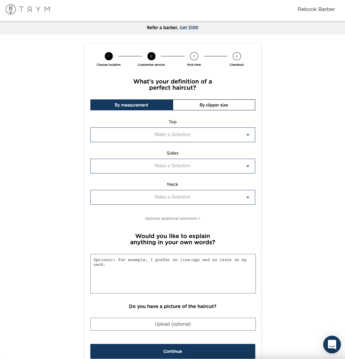
Here is their outcome below with key screens:
A new booking funnel was successfully designed, built and launched within 2 months. We were able to:
- Increase conversion rates from 3.15% to 9.16%
- Led to Trym's 600% YoY growth in 2020
- Reduce CAC by 65%
Funnel improvements:
- 13% increase on home page click through rate
- 4% increase on checkout conversion
